PRODUCT DESIGN · CONTRACT
PeakPOS
End-to-end product and visual design for a point-of-sales startup serving specialty retail. Design system, marketing site, and stakeholder-driven iteration.
Context
BackgroundPeakPos is a point-of-sale platform for specialty retail merchants: smoke/vape, liquor, tobacco, beauty. I came in as the first designer. There was no existing system, no visual direction, and a product that needed to grow beyond its niche without losing its identity.
The primary stakeholder wanted something bold and memorable. A site that felt like a real product, not AI slop. A second stakeholder wanted something closer to Stripe: clean, light, credible. I had to design for both without watering either down.
Competitive Research
Research InsightBefore touching Figma I studied Stripe, Square, Toast, and Clover. The best POS marketing sites drive one idea per screen and let the product speak visually. PeakPos was doing the opposite: too much at once, no clear audience moment, visual inconsistency between sections.
Direction One: Bold
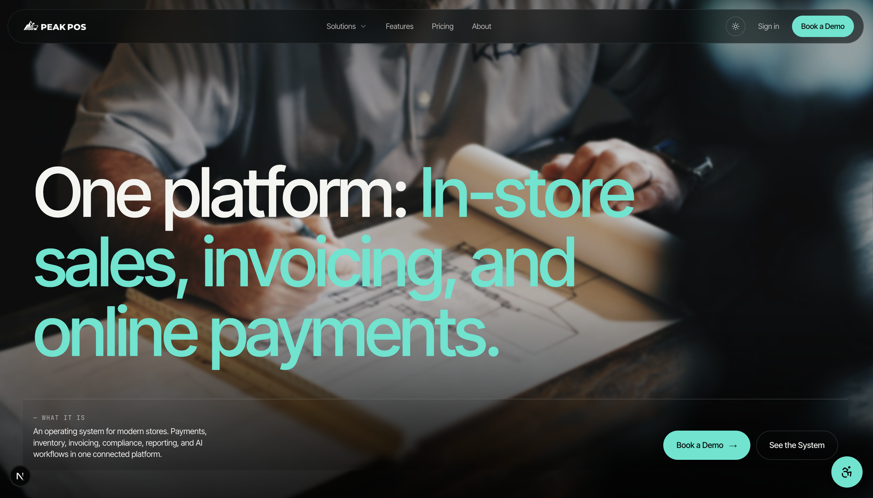
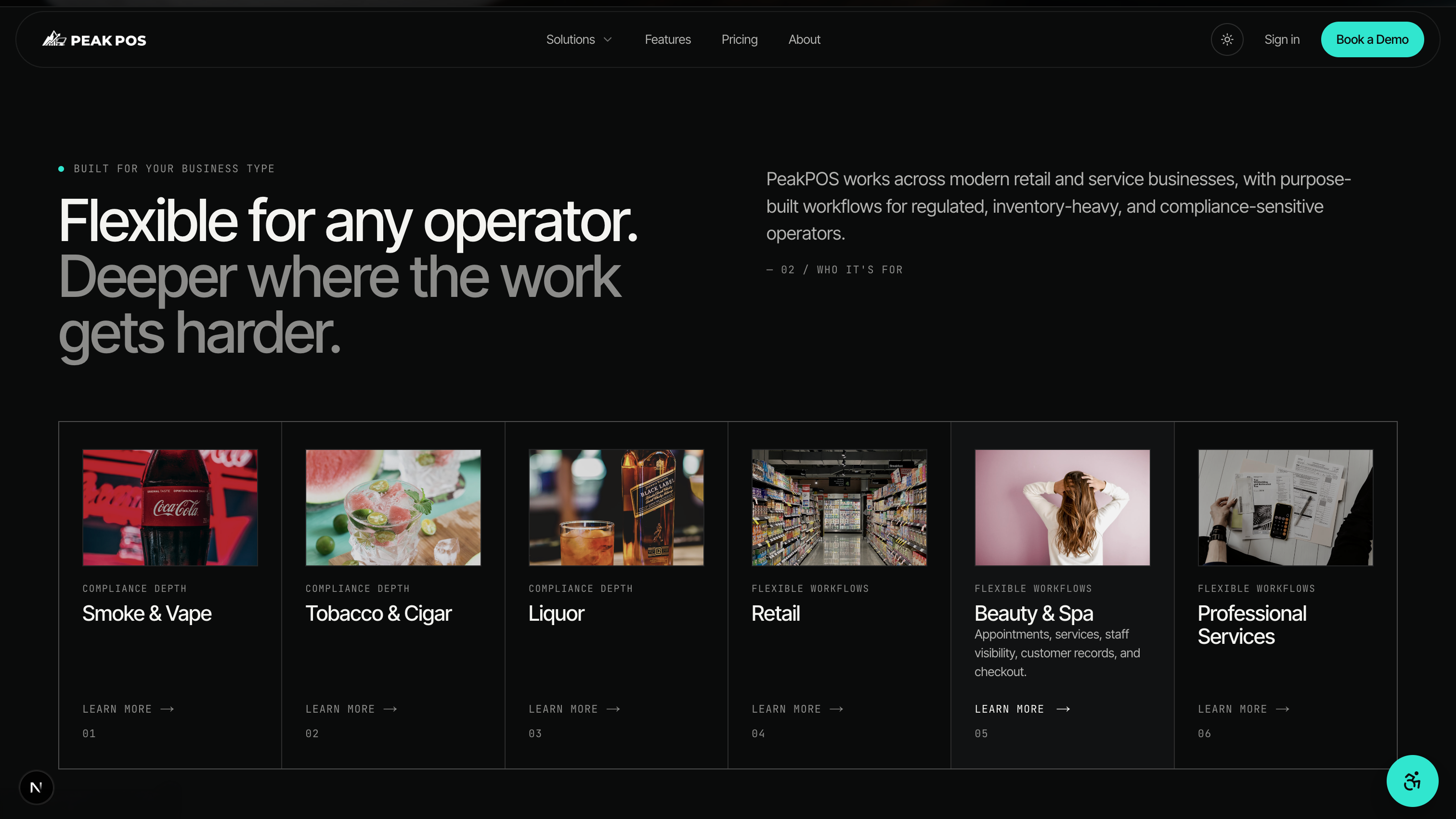
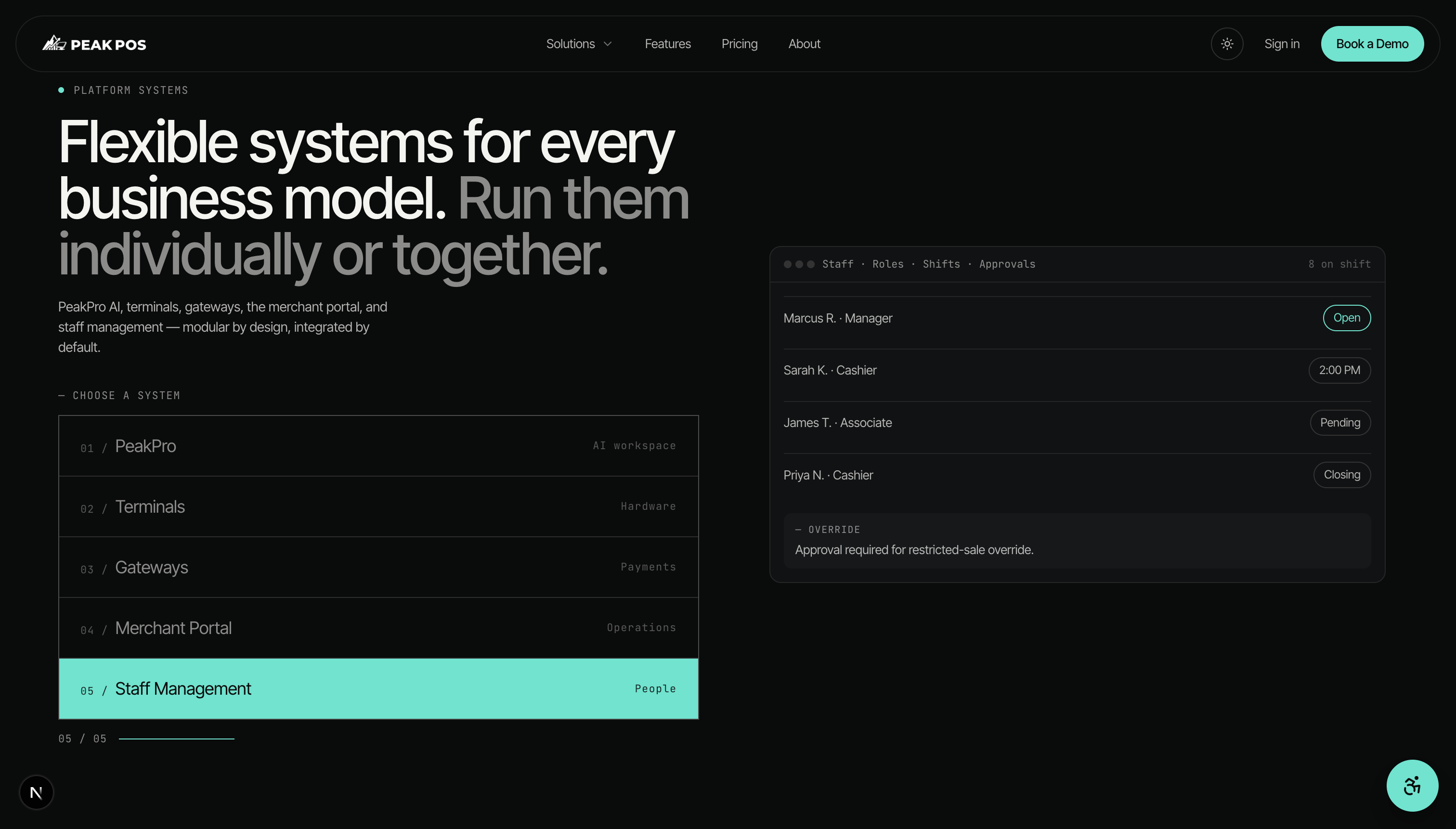
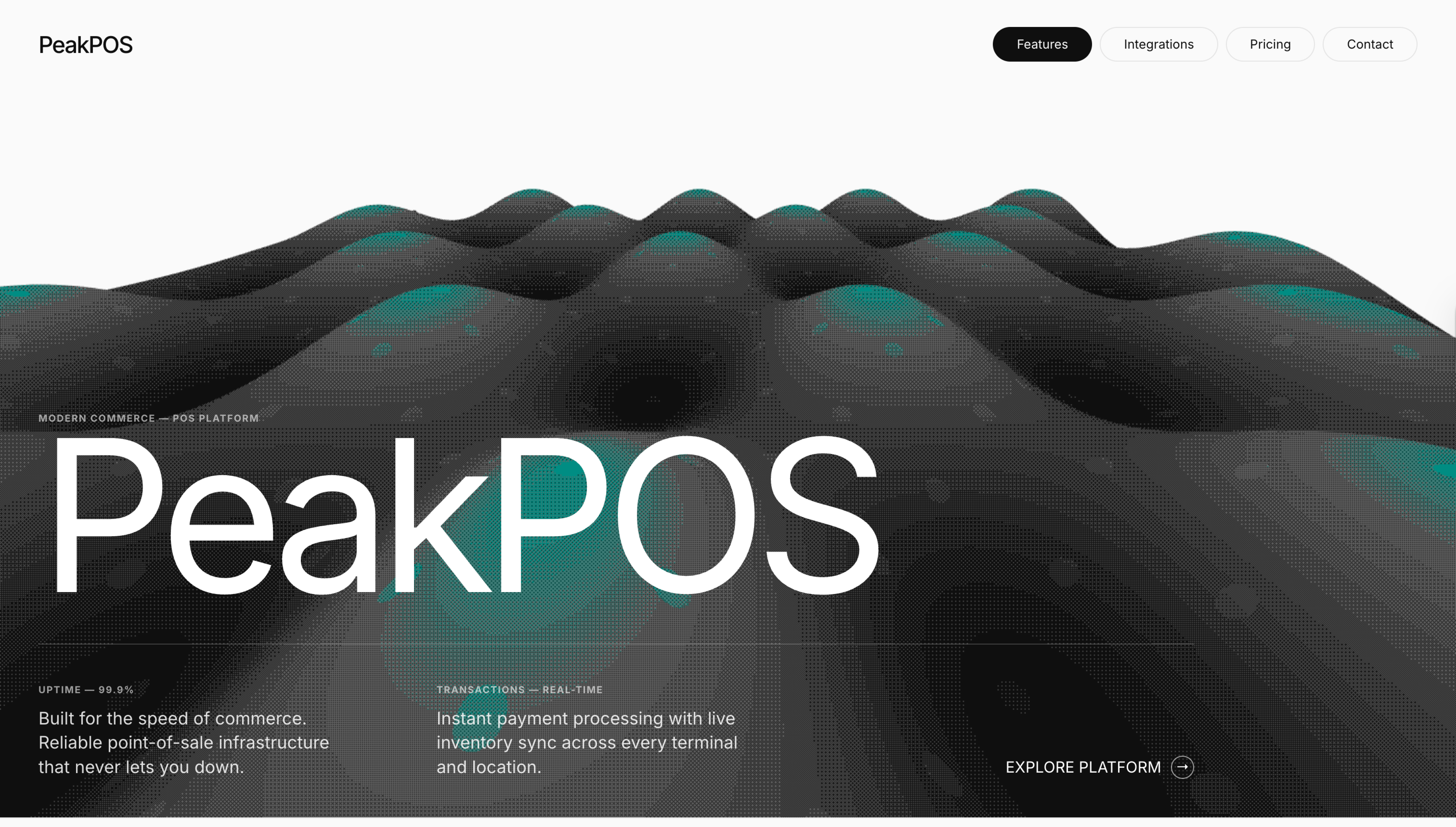
V1 — Shipped InternallyThe first direction leaned into contrast and editorial energy. Dark backgrounds, large type, motion. The primary stakeholder responded well. It shipped internally as v1.
Stakeholder Pivot
The Turning PointThe primary stakeholder responded well to the bold direction, and it shipped internally as v1. But a second stakeholder pushed back. The dark aesthetic felt developer-facing, not operator-facing. The reference point he kept returning to was Stripe: light, spacious, credible. I went back to the drawing board and redesigned around a light system with a single accent color, one dark section for compliance, and clearer information hierarchy throughout.
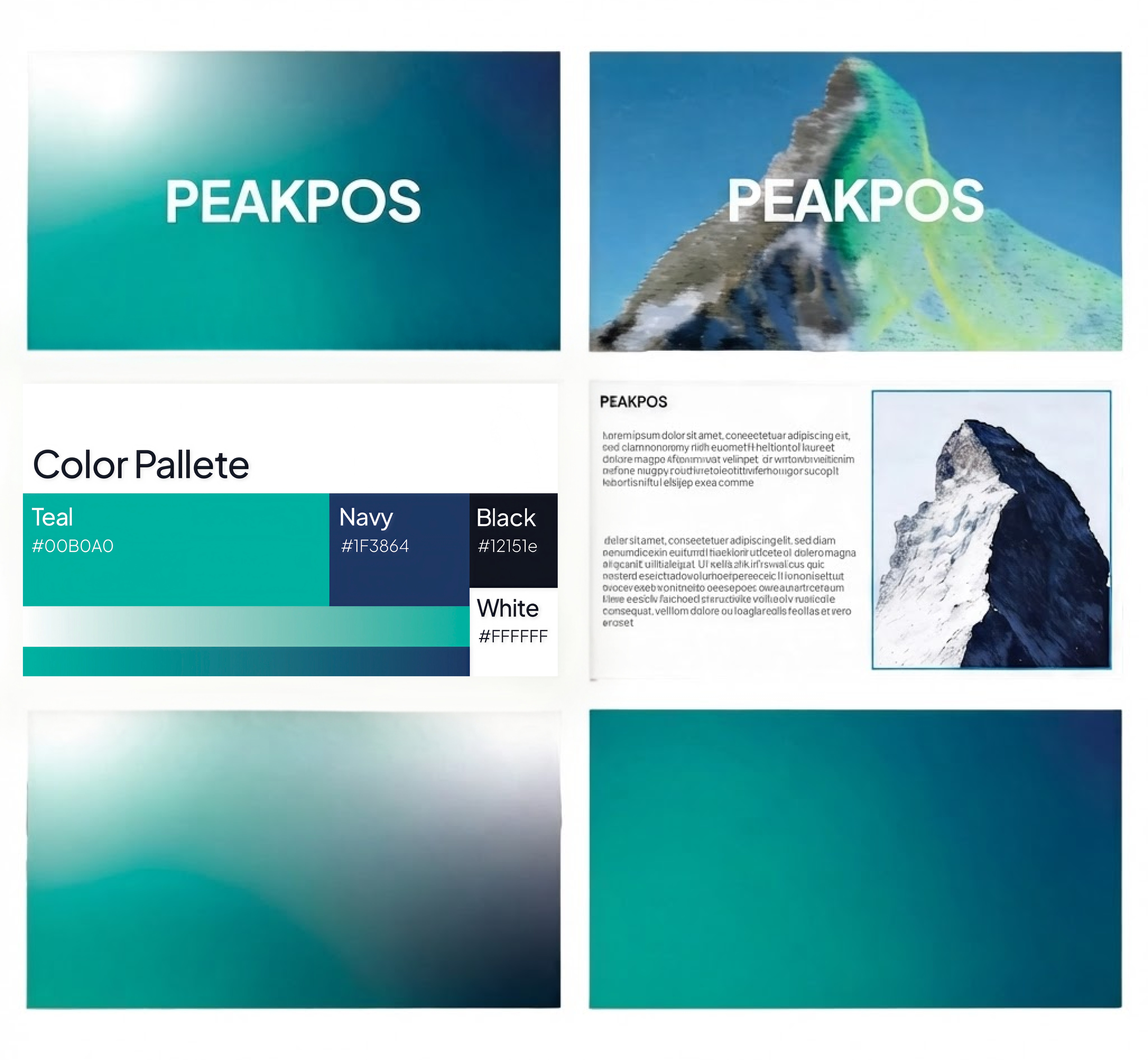
PeakPOS came with an existing logo and brand colors. The teal (#00B0A0) and navy (#1F3864) were already established. My job was to work within that system, figure out how to extend it for a product context, and make calls like opting for Inter over Plus Jakarta Sans for legibility at dashboard scale.
Color Direction
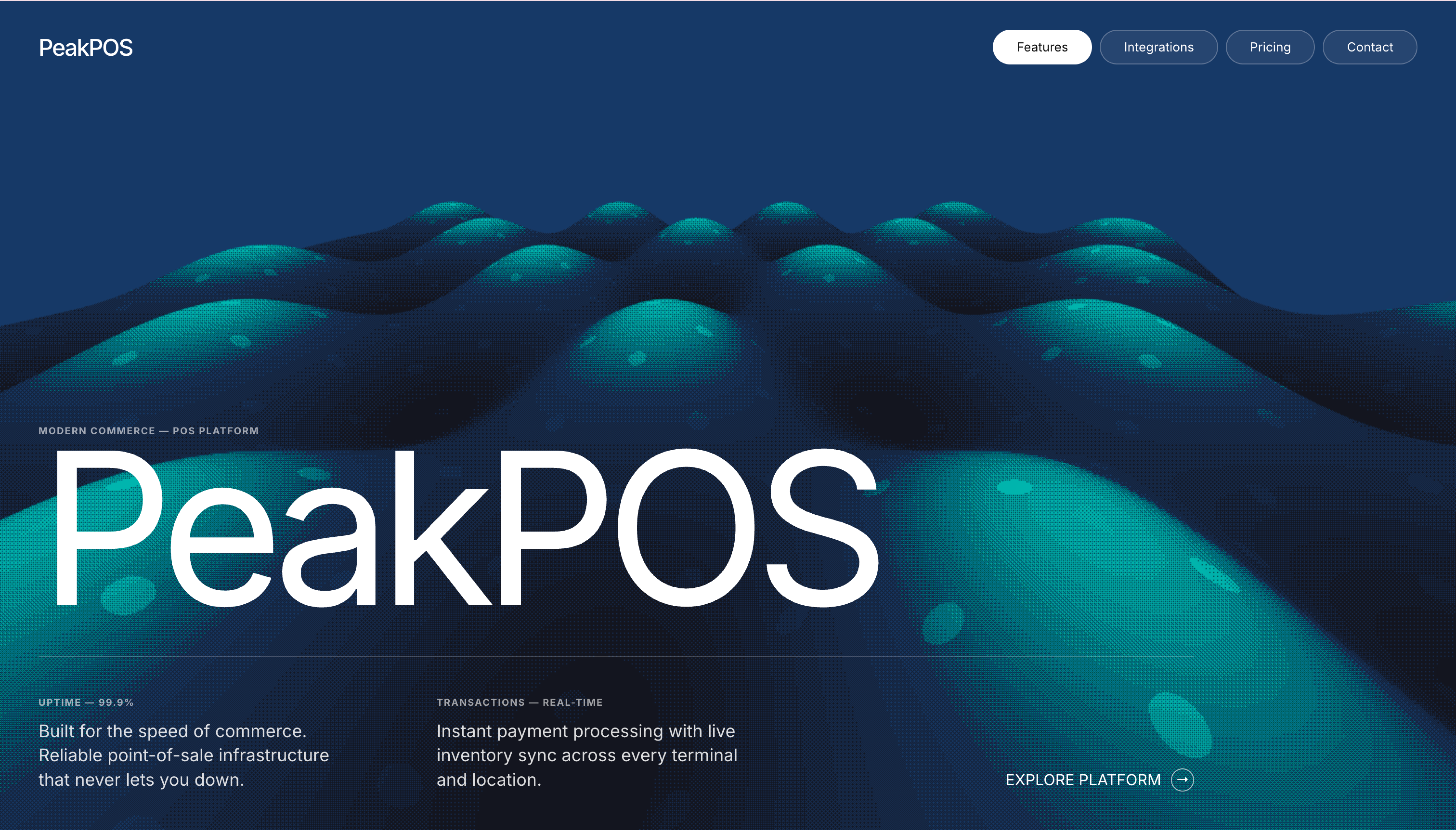
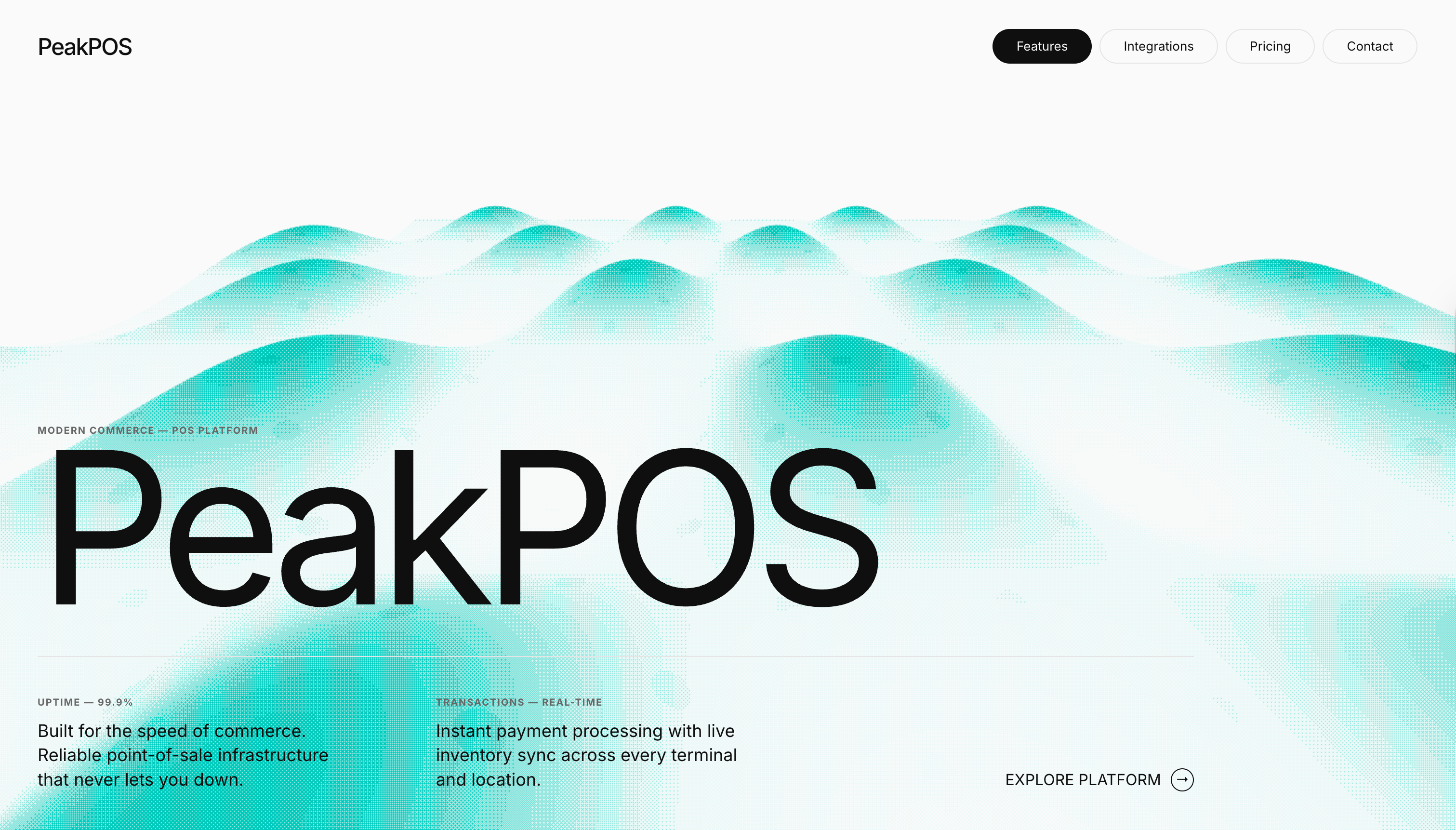
V1.5 — Bridge DirectionThe second stakeholder pushed back on the dark direction. It read too developer-facing for a POS product that needs to feel approachable to retail operators. I kept the 3D wave motif (a visual nod to 'peak') but explored how it felt across different color systems before committing to the teal light direction.
Final Direction: Iterations
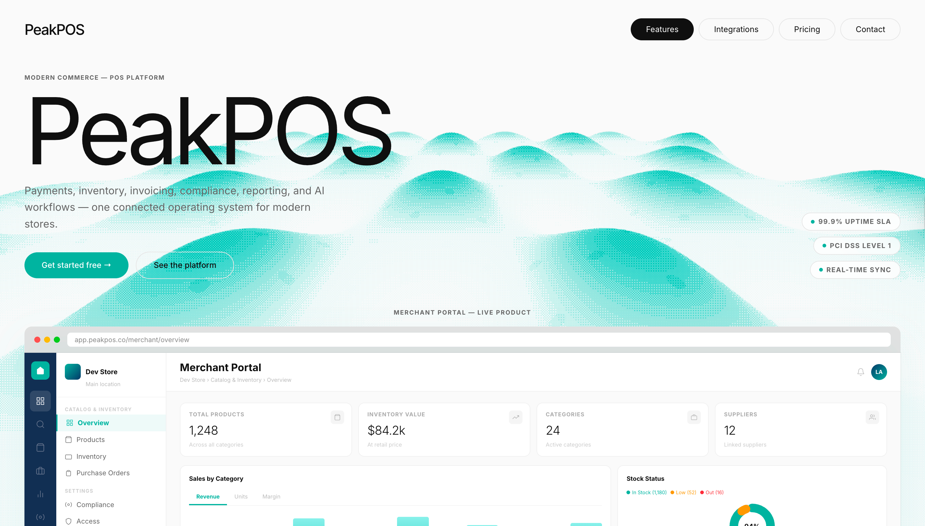
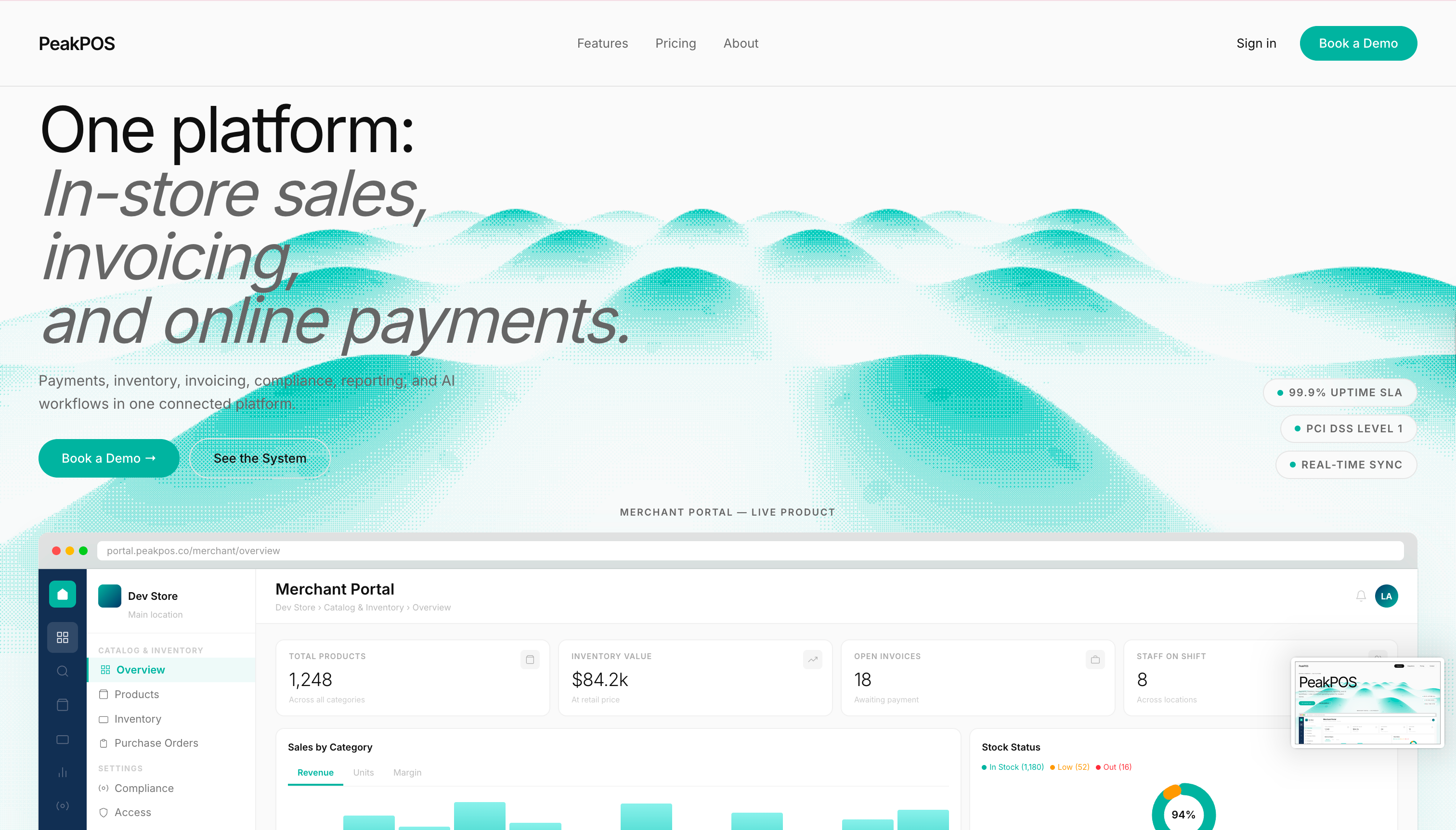
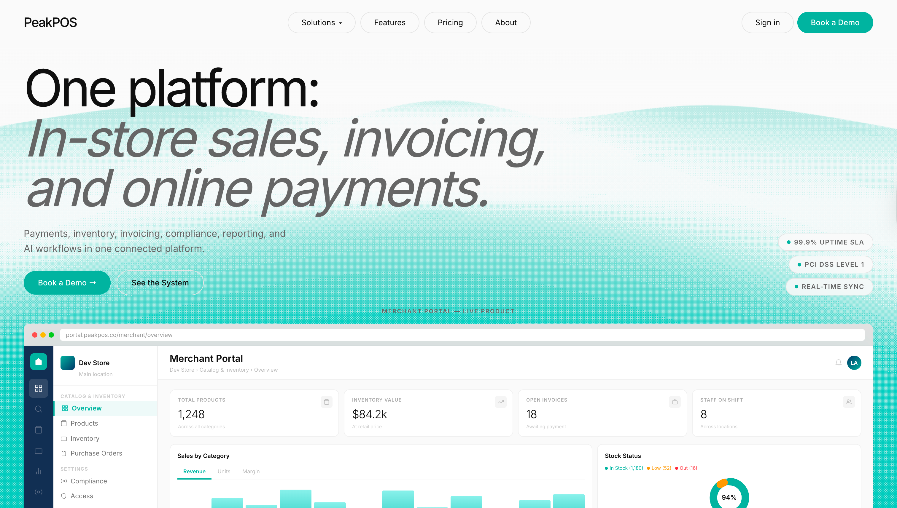
V2 — Stakeholder AlignedWith the teal light system decided, I iterated on the hero layout, moving from a bold wordmark approach to a headline that immediately communicated what the product does. The merchant portal was brought up above the fold to show the live product faster and lean less on demos.
Merchant Portal
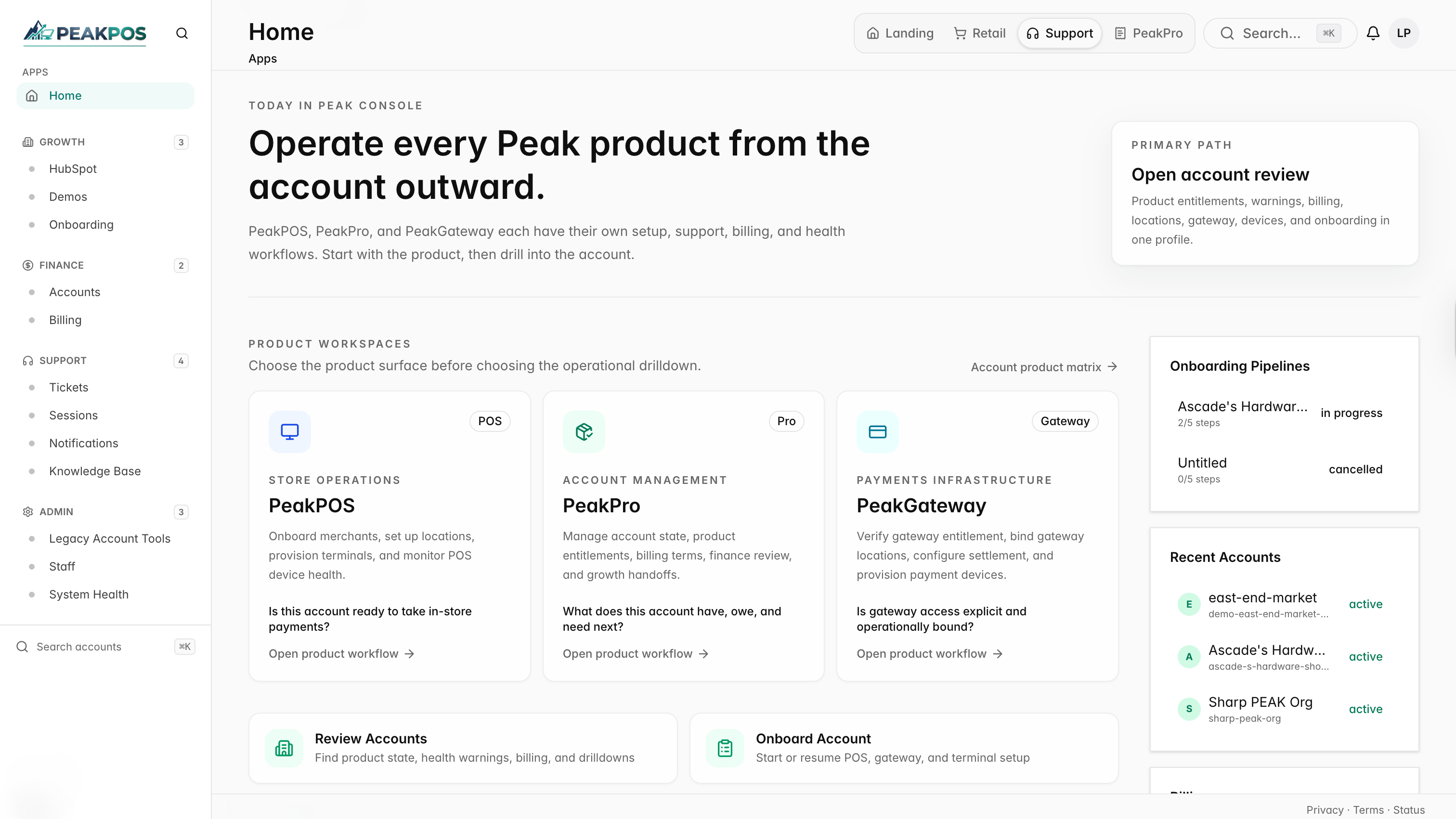
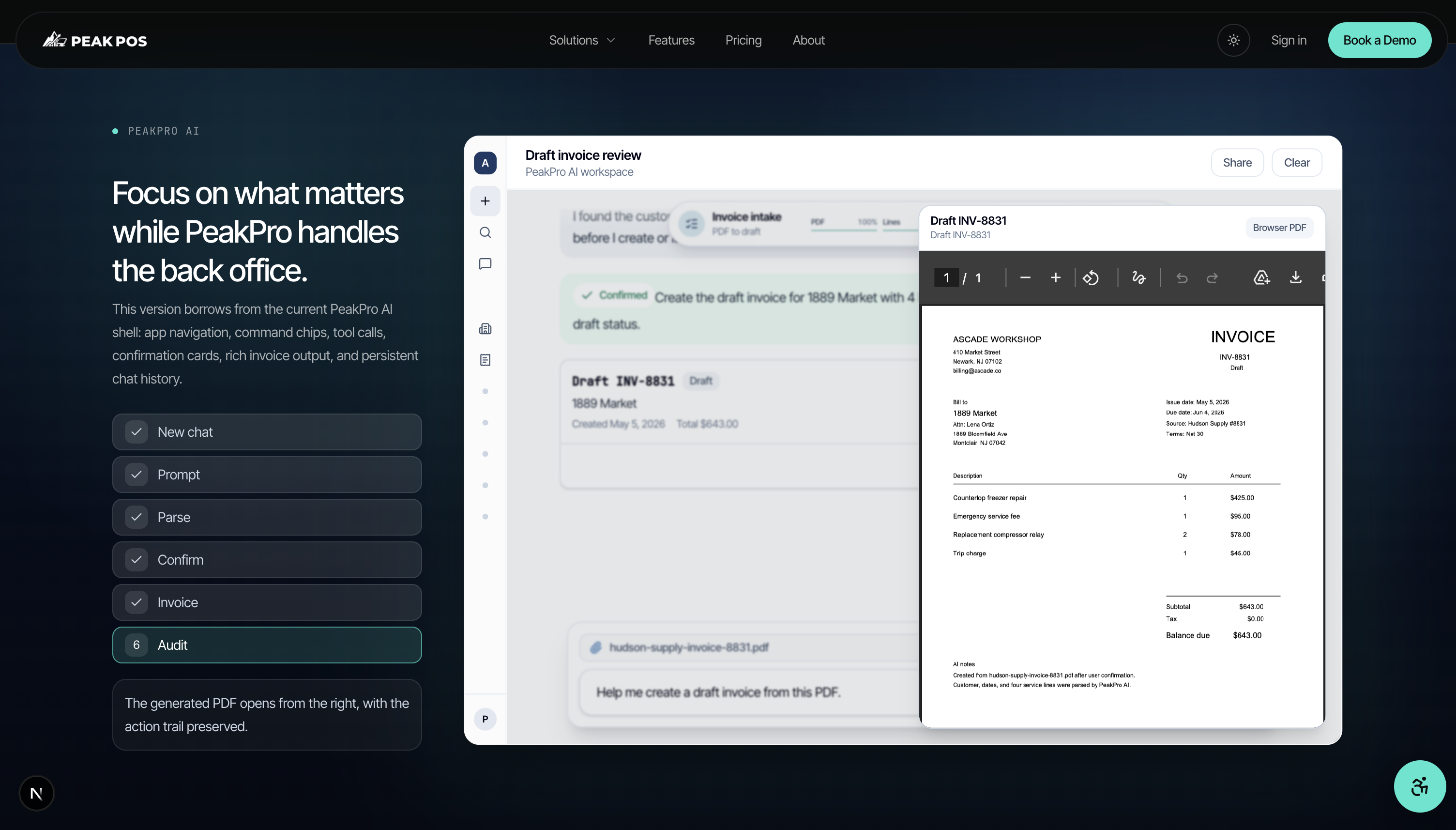
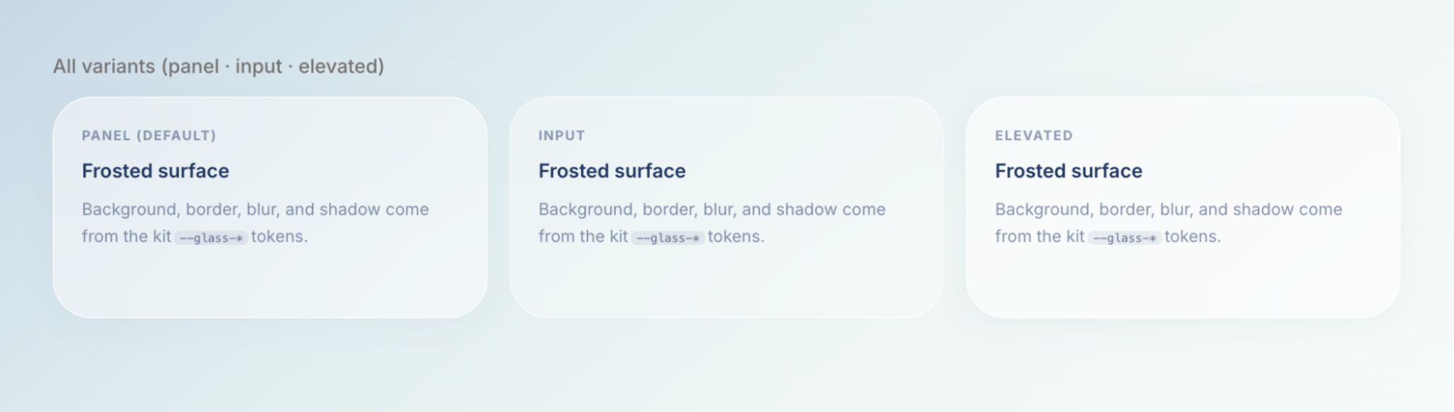
Dashboard & PortalThe existing portal had no visual connection to the PeakPOS brand. Generic layout, no hierarchy, no motion. I redesigned the sidebar navigation, which was a key stakeholder complaint, and introduced a frosted glass system on a gradient background. Then came the micro-interactions: the sidebar expands on hover with staggered label fade-ins, KPI cards animate in on load, and nav active states use brand cyan.
Design System
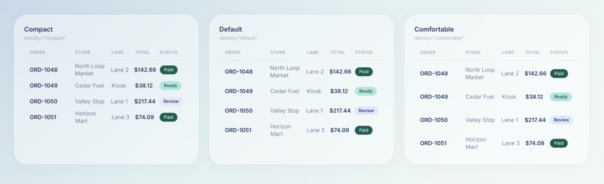
Component LibraryWith no prior system to inherit, I built a component library from scratch: status badges, density profiles, navigation patterns, and UI tokens implemented across Figma and code. The most meaningful problem was that Ready and Review status badges looked nearly identical despite meaning very different things. Review demands human attention. Ready is passive. I redesigned the status palette around semantic color logic rather than visual grouping.
All components were built and documented in Storybook. Variants, states, and edge cases were verified in isolation before integration.
Three density profiles (Compact, Default, Comfortable) let merchants match display density to their workflow and screen real estate.
Reflection
Looking BackIf I were to revisit this project, I'd push earlier for a single visual direction before stakeholder review. Presenting two competing aesthetics in parallel created confusion rather than clarity. I'd also invest more in documenting design decisions as they happened, rather than reconstructing the rationale afterward.